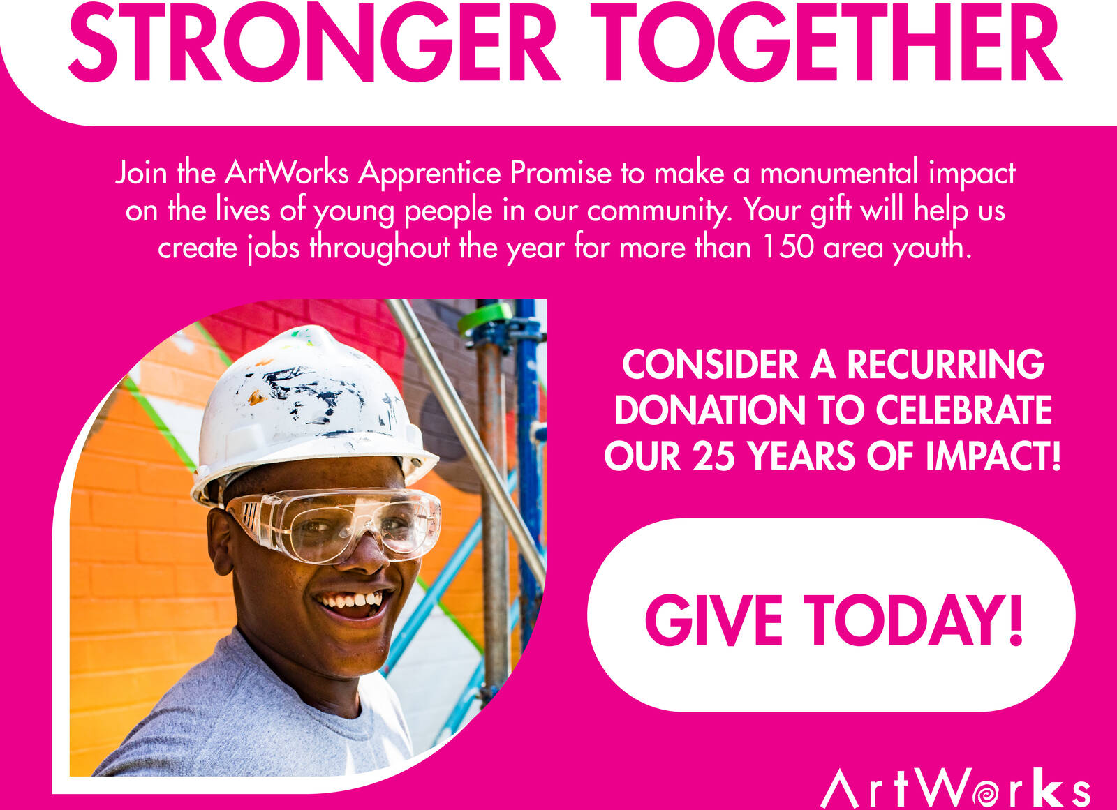
As we begin our celebrations for Thanksgiving and Native American Heritage Day, ArtWorks would like to thank our community’s heroes.
We are continually inspired by the giving and innovative spirit of our community to tackle challenges and create solutions to meet the needs of others. So earlier this year, we asked the community to nominate local heroes—those who are working behind the scenes using their talents, courage, creativity, and generosity to meet the many challenges our community has faced this year.
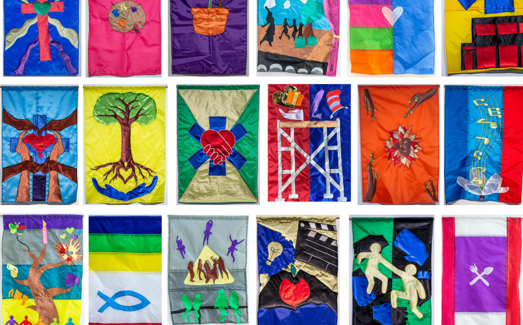
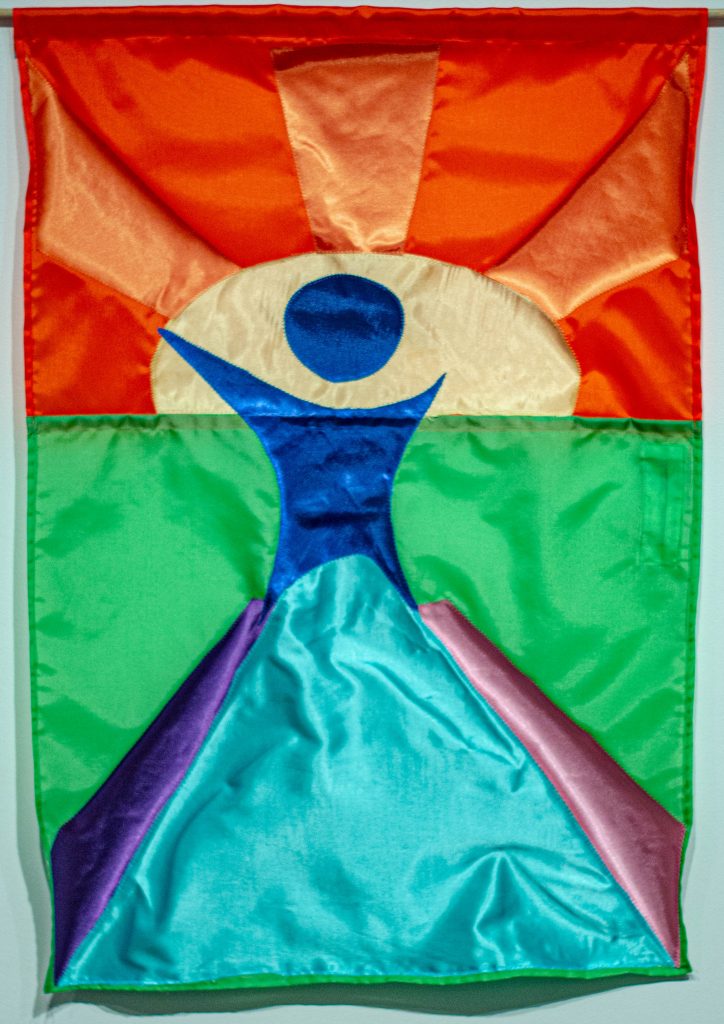
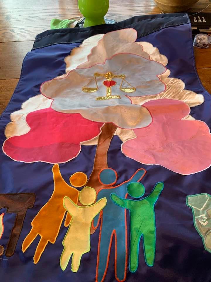
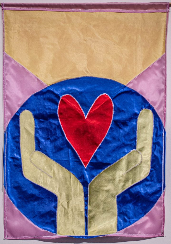
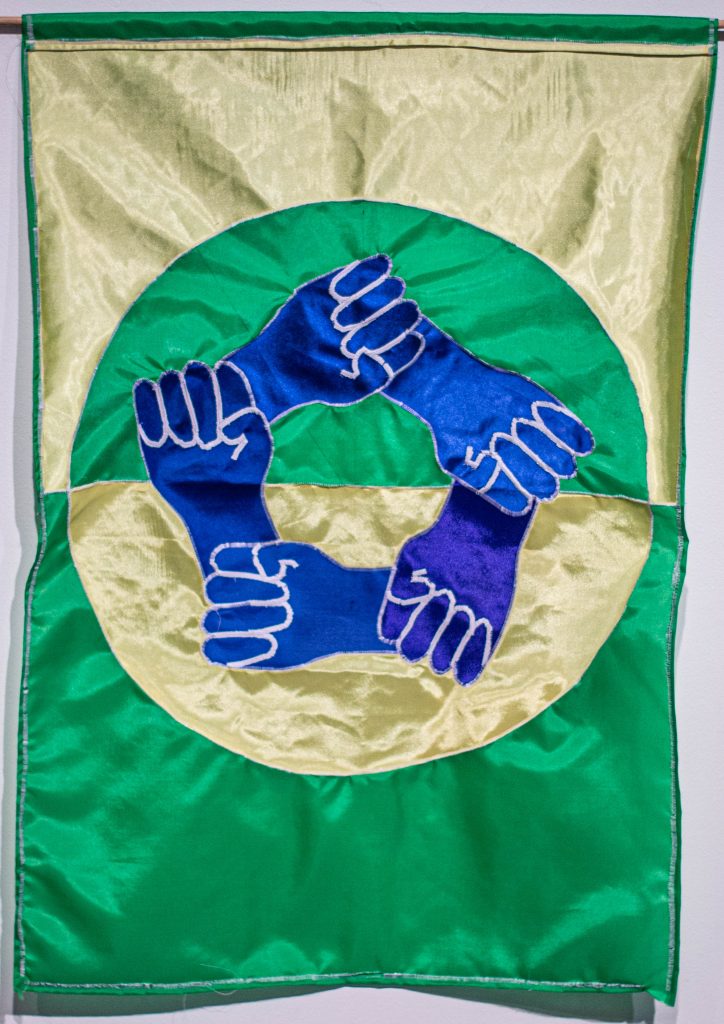
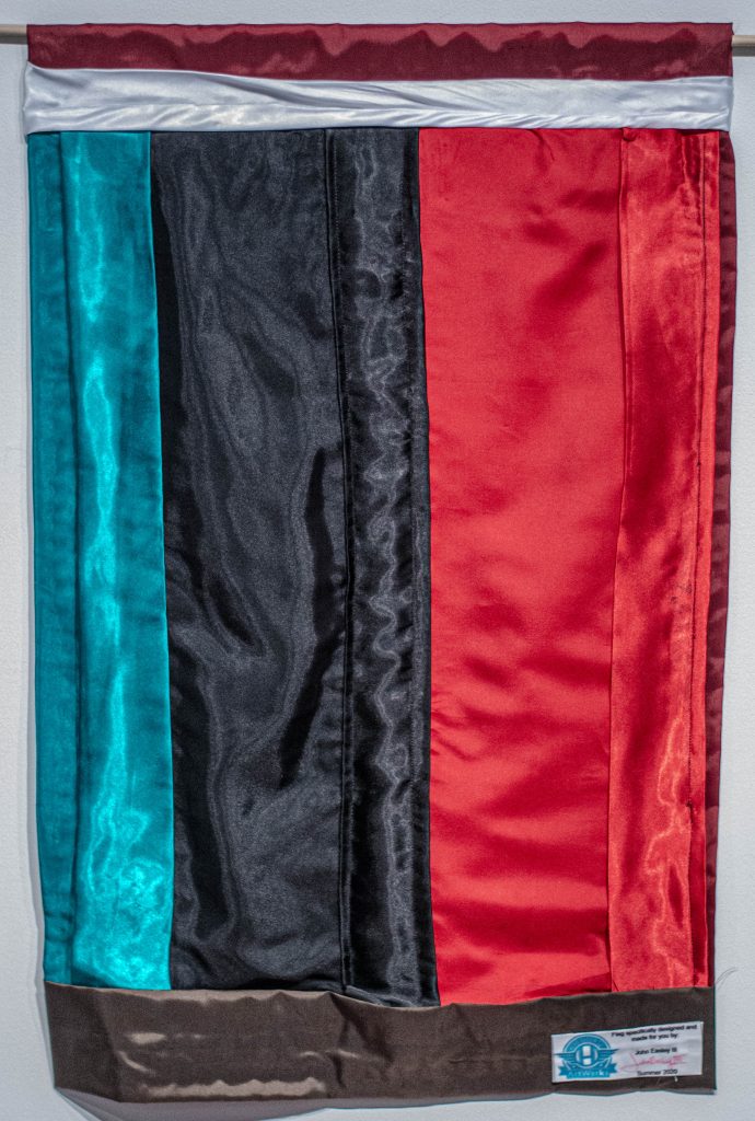
As part of the Hero Design Company, ArtWorks Youth Apprentices this summer designed and sewed custom one-of-a-kind flags while safe at home to honor and bring attention to local heroes whose selfless acts set them apart. The team was led by professional artist Lindsey Whittle.
Your response for nominating heroes was amazing! We created flags for as many as we could.
The team’s work was flown during on installation on Central Parkway in September. We are honored to share the nominations and images from this project with you.
Read the Stories of our Community Heroes
Tika Adhikari
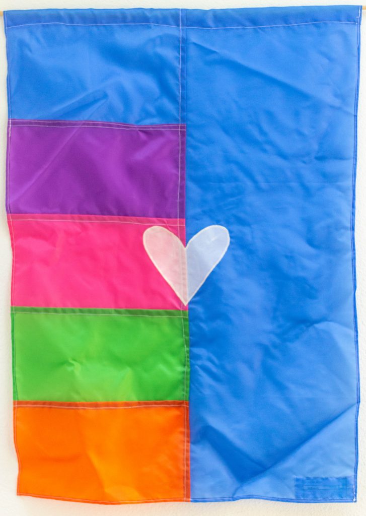
What our nominator wrote: “It is with pride that I nominate Tika Adhikari as a Community Hero. In 2014 she served as a Nepali language interpreter for Bhutanese refugees seeking employment in Cincinnati. In December 2017, Tika reached out to Refugee Connect inquiring about opportunities to volunteer looking for hands on ways to apply her newly chosen major social work. She first served as a volunteer intern expanding our Refugee School Impact program to Aiken High School. In this role she worked with refugee and immigrant students from over 15 countries of origin with disrupted education to acclimate to high school and reduce barriers to academic and social success. Tika was interviewed by the local NPR station where she describes her experiences immigrating to the U.S. as a refugee when she was a teenager. In 2018, Tika’s impact transitioned as a paid co-op when she became Refugee Connect’s first Health Navigator. This pilot was funded to holistically address barriers facing new arrival refugee students and their families. Her role included assisting parents in gradually overcoming health barriers such as missed appointments and missed school time due to medical needs. She guided families in seeking care at appropriate health care site (clinic, ER, urgent Care, pharmacy) through care coordination and health literacy. She is an active listening in her everyday interactions. She lives her truth with authenticity and empowerment lens that exemplifies the values of being a Community Hero. With strong drive to learn and bring ideas to life, Tika brings incredible passion and action to her work with the community. Tika will continue to be a change agent through her culturally responsive work. In 2019 Tika joined the Civic Action for Refugee Empowerment Research Team. As a co-founder and co-researcher, she conducted an assessment with local refugees around resource access and opportunity. is an active volunteer at the Bhutanese Community of Cincinnati. She is the former treasurer of the Bhutanese American Student Organization at the University of Cincinnati, a campus organization created by students who came as refugees to the U.S. that focuses on community engagement and service. Tika now serves as the Assistant Resource Coordinator at Mt. Airy School. She also is finishing her senior year studying social work at NKU. She also continues to be an asset to the Refugee Connect serving as a Community Navigator for COVID Rapid Response, Operation ONE Greater Community. She ensures refugee families have access to basic needs like food, employment, housing, and other essentials, academic support for school-aged children, and mentorship and community engagement opportunity, all remotely which took a lot creativity, perseverance, and patience. I am honored to thank and name Tika’s impact as a leader who shows her love by empowering others.
What Our Apprentice Lauren Fredickson wrote about the flag design: “I used a sun in the background of the flag to represent the bright light you bring to everyone you help. The dark blue person represents the trust the people you work with put into you. The pink and purple stripes are laid out to represent arms reaching out to help anyone who needs it.”
Drew Ahern
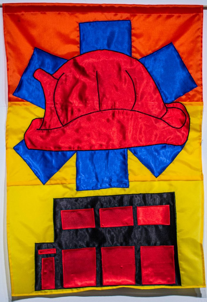
What our nominator wrote: “Drew Ahern is a Cincinnati firefighter and paramedic. He has been working, primarily in Price Hill, on the front lines of the COVID-19 crisis since the beginning. He has been putting his life on the line every day to help those in our community who are facing crises and emergencies. He is a devoted friend and husband, and a true community hero.”
What our Apprentice Gwyn Barnholtz wrote for the flag design: “For your service in the Cincinnati Fire Department in Price Hill, the center symbol is a fire department helmet. Underneath, the outline of the Star of Life represents your service as a Paramedic during the COVID-19 crisis. Underneath these symbols lies the outline of Station 17 in Lower Price Hill. For the colors of the flag, I chose blue to represent perseverance and vigilance. I chose red to represent devotion, courage, and strength. I chose yellow to represent the inspiration and friendship acknowledged by members of Price Hill that admire your service. Thank you for putting your life on the line for other people and community! It has been such a pleasure to create a flag in your honor for all that you do!”
Robbe Bluestein
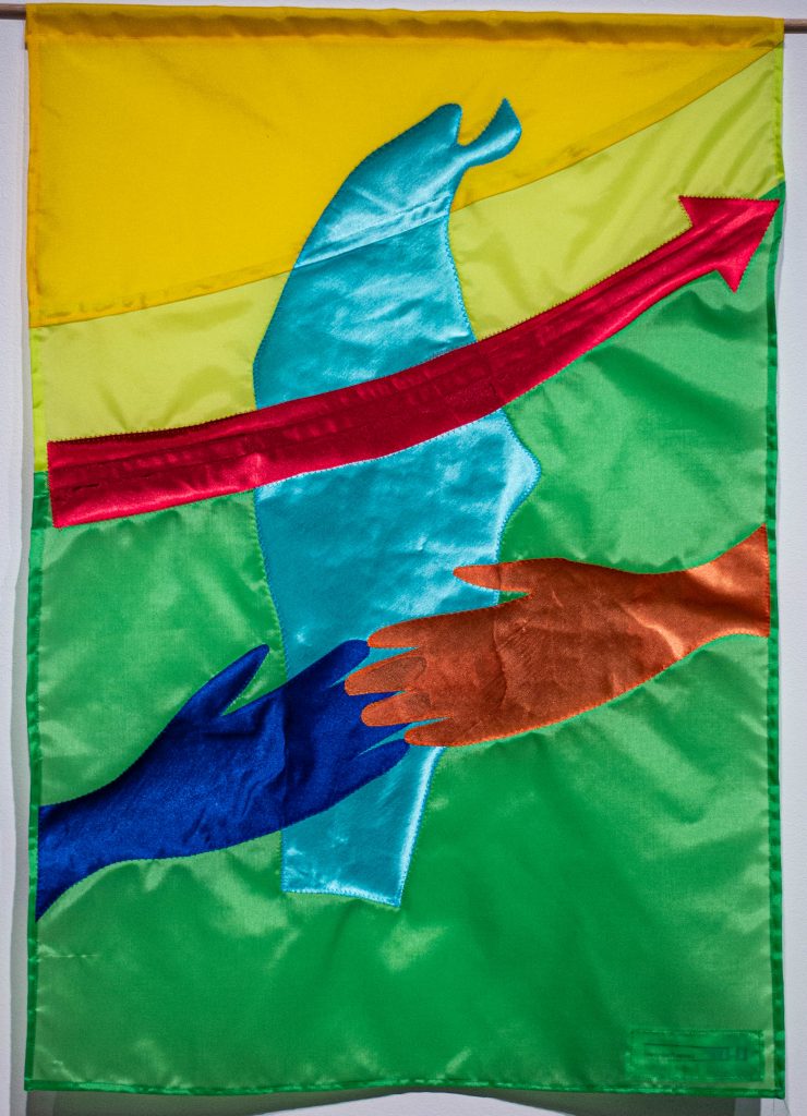
What our nominator wrote: “Robbe Bluestein is always up for the challenge. If there is an issue in Camp Washington he is ready to tackle it. From upping Community Council memberships to getting people registered to vote, to connecting neighbors to each other in order for better progress to be made, Robbe is a true hero. He stepped up to the plate when our Community Council was at risk, and is now the President, leading us all towards more civic participation and leading us towards true democratic decision making in Camp Washington.”
What Our Apprentice Lauren Fredickson wrote about the flag design: “On your flag I wanted to put the shape of Camp Washington to focus on all of the amazing things you have done. I put a red arrow to show the growth you have brought to the community council and to the neighborhood. The two hands represent the connections you are creating during your time as President of the Community Council.”
Tia Brown
What our nominator wrote: “Tia Brown is amazing. Tia truly meets people where they are at and supports individuals as they reach their goals and aspirations. Tia is driven and passionate for the West End and she won’t let a global pandemic prevent her from serving the community! With creativity and resolve, Tia has developed new ways to safely connect with the community. In her role at Seven Hills Neighborhood Houses, she leads weekly virtual live stream and zoom sessions designed connect people with resources including eviction assistance and trauma recovery services. As the Executive Director and co-founder of the West End Art Gallery, Tia nurtures community through art. When people were first isolated at home due to the stay at home order, Tia organized ‘stay home stay safe’ kits with art supplies for West End families and seniors. Tia’s collaborative spirit is contagious. She sets the virtual table, so everyone feels welcome and able to contribute. She brings people and organizations together in creative ways.”
What Our Apprentice Reagan Holtzman wrote about the flag design: “The designs and colors in this flag highlight your work in the community. The shape of the logo mimics the shape of the neighborhood you primarily work in, the West End of Cincinnati. In the middle of the design is a symbol of nurture and uplifting, both things you notably work to encourage in your community. The colors of the actual base flag were directly inspired by The West End Art Gallery that you established and opened. Overall this flag is meant to emphasize and visually represent the work that you do for your community.”
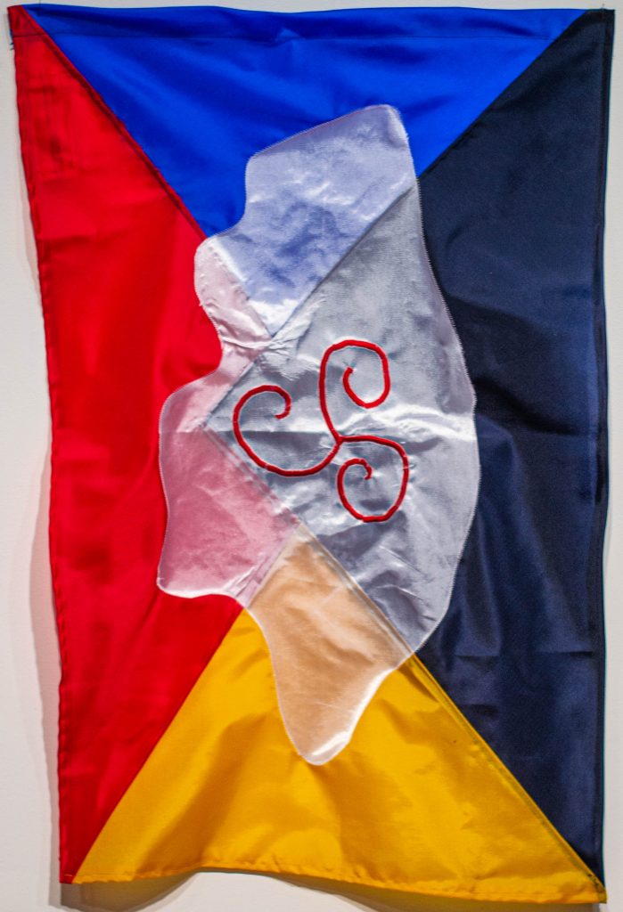
Sister Janet Bucher
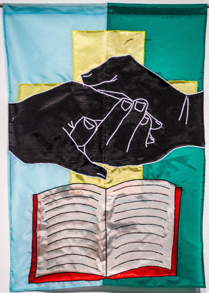
What our nominator wrote: “Sister Janet Bucher is a nun whose faith combined with her community work exemplifies the tradition of women who have committed their lives to the teachings of Christ about love, humility and service. Most of us in the metro region know her from her work at the Church of Our Savior in Covington’s predominantly African American and impoverished Eastside Neighborhood. The church is a contrast to the great Catholic cathedrals and churches of our community. It more resembles a country church— a simple, concrete block building first established with a school during the latter days of segregated education. Sister Janet has presided over the parish for many years as an extension of St. Mary’s Cathedral, the grand dame of the Diocese of Covington. Sister Janet has fought to keep the church open even as she has provided education programs for her congregation, including sessions to improve police/youth relations, community forums and seminars topics as wide ranging as health to racial understanding. She was among the community leaders who in the 1990s fought rename Covington’s 12th Street for Dr. Martin Luther King Jr. Her interests are not only local. As the Kentucky Human Rights Commission noted in naming her to its Hall of Fame in 2010: ‘Sister Janet has used her voice to end wars, fight poverty, racism and sexism.’ For all this advocacy, accomplishment and persistence, you will never—not once—find Sister Janet seeking accolade for herself. You will find her seeking voice and consideration for the needy and neglected. She grew up in Covington and entered a convent while in high school. She was a teacher for 25 years, teaching in Kentucky, Ohio, Rhode Island, and Maryland. At one point, she helped to develop an experimental, diocesan school that was ungraded and included experiential education. Her ‘community’ (the Sisters for Divine Providence) asked her to go Ecuador to serve in a poor village to teach and to teach teachers. Back in Covington, she came to the Welcome House, cooking and housekeeping at the shelter. She left there for a Navajo reservation in Arizona, where she taught and tended to the needs of native families, bringing them clothing for example. Her Our Savior service stint followed at the invitation of the bishop in the early 1990s. From that position, she became a potent voice for the neighborhood and its people. She, for example, was part of the team to create an emergency shelter for homeless people. It took time to find a place but, as is her way, she persisted until the need was met. When the shelter outgrew its site, she went to work against zoning and other obstacles to find a new, larger site. Her work has given her clear understanding of what’s needed for the poor: Jobs and housing. She is also a regular visitor to local jails for prayer services, and she writes to those she’s met after their release.
What our Apprentice Gwyn Barnholtz wrote for the flag design: “The central symbol on your flag is hands, one pulling the other up in aid. This represents your selfless care for others— such as your fight to keep your Church open to provide others education, your efforts as a teacher for 25 years, your work to help Natives living in poor villages in Ecuador, and your efforts helping the homeless through jobs and housing. There is a cross, representing your Church and values. The book symbolizes education, from educating students to adults on racial issues. This selflessness and action to help less fortunate individuals is incredibly admirable and inspired me while creating your flag. For the colors of the flag, I chose blue to represent wisdom and protection for those needing help. I chose green as a representation of growth and hope, principles of which you embodied throughout your career as a teacher and while acting as a voice for others. I chose yellow to represent the positivity that you have brought to Cincinnati and Covington, and your active role in our community. There is a small bit of red on the book, representing your compassion for others and your devotion to our community.”
Taren Carr
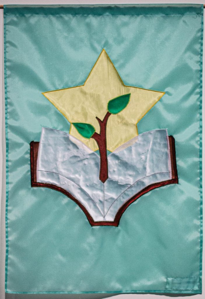
What our nominator wrote: “I would like to nominate Taren Carr of the Cincinnati Recreation Center. Taren is one of the most dedicated individuals to the youth in the community of Corryville. Taren has personally provided for youth in the form of purchasing personal items needed for youth. To assisting families with food and other supplies. Many children are better off because of the unseen work of Taren Carr. She is a leader not only to the staff at the Corryville Recreation Center, but a pillar in the community.”
What our Apprentice Simon Foster wrote about the flag design: “Because of your dedication to the youth, I wanted to focus on the way that you help and guide them. With this in mind, the book represents the knowledge that your provide the youth, and the plant growing from the book is a symbol of the seed that you plant in the youth growing. The star is a symbol of the youth and your guidance. Finally, the green of the base also represents the youth and their growth.”
Chevy, Cincinnati Children’s Therapy Dog
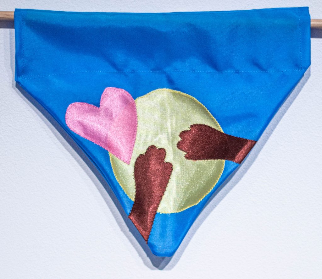
What our nominator wrote: “Chevy is a Golden Retriever and Black Lab mix who is a new facility dog on our Child Life and Integrative Care team. Chevy works primarily with inpatients, but he also regularly visits with patients throughout the medical center. As he and Katie make their way through the hospital each day, Chevy gets lots of adoring looks and excited whispers. Chevy is known for his signature move of stopping, picking an individual and dropping to the floor to roll on his back for a quick belly rub. And anyone who has experienced it knows that he’s not shy about asking for that attention. But when Chevy is with a patient, it’s no longer about attention for him, his job is to be a calming presence for that child. He is also a great physical therapy tool because taking him for a walk is often just the motivation a patient needs to get out of bed for therapy.”
What Our Apprentice Lauren Fredickson wrote about the bandana design: “I chose a blue background because it can often stand for calming others, a large part of your everyday work. The yellow circle in the middle along with the heart stands for the bright light, love, and joy you bring when visiting a patient. I added two paws to represent the support you give as well as your love of belly rubs.”
Dorothy Darden
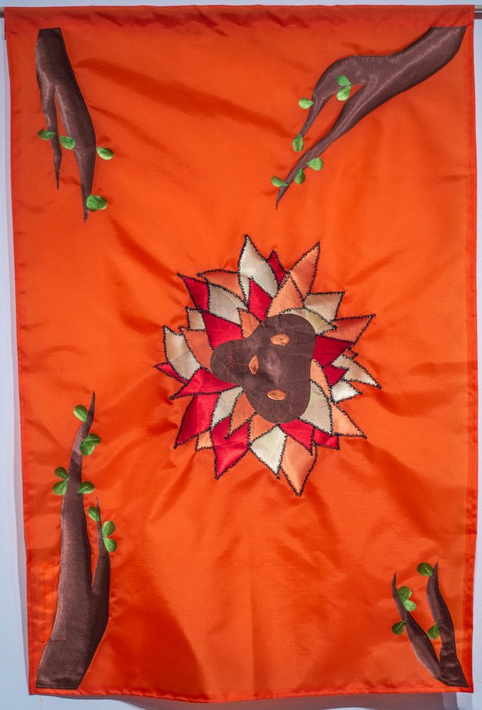
What our nominator wrote: “Ms. Dorothy is a community mentor. Her lived experience teaches many in the neighborhood as well as college students who come and learn from her life experiences. She helps prepare them to work in urban core neighborhoods. She asks tough questions and challenges students to address power and privilege in their lives. She is not afraid to speak up for her people, that Black Lives Matter, and until they do, the world we envision can’t come to fruition. Ms. Dorothy can be heard at Community Council meetings speaking out for affordable housing, saving our parks and recreation, and challenging developers to listen to what the people need and want. Ms. Dorothy can put you in your place, but also lift you up with her loving embrace. Ms. Dorothy is a family person, and she stretches that to include the broader community. She knows intuitively we are all a part of one big quilt, for me she’s the heart at the center.”
What Our Apprentice Reagan Holtzman wrote about the flag design: “The colors of the flag were inspired by your work and the Peaslee Neighborhood Center where you work. I chose to use a lion because it symbolizes a strong and powerful leader. The tree branches are meant to resemble hands reaching out into the community. These symbols represent the hard work and contributions you make to the community.”
Dr. Michael Della Ripa
What our nominator wrote: “Every day, Michael is making a difference in the lives of really ill dogs and cats. Veterinary medicine is a very difficult field because a lot of what veterinarians do can go unnoticed because the service they provide is being provided to pets that cannot communicate verbally. As pet owners we need to do better in thanking our veterinarians for everything they do for our pets.”
What Our Apprentice Reagan Holtzman wrote about the flag design: “The background colors in this flag were chosen to highlight the bravery and perseverance you exude in your practice. The logo is meant to symbolize the work you do every day, caring for and treating animals especially those that are very ill. The whole point of this design is to shed light on your work, which oftentimes does not get the recognition it deserves.”
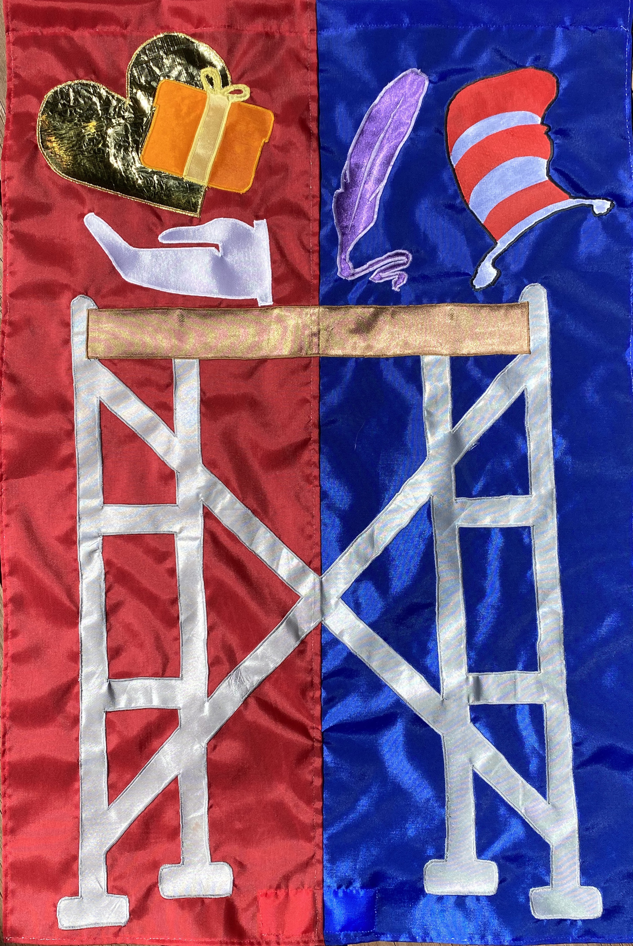
Dr. Bob Donovan
What our nominator wrote: “Bob Donovan, a physician and Marianist established the Center for Respite Care, dedicating 25+ years of service to people who are homeless in Greater Cincinnati. After graduating from medical school, he set up private practice and for four years served families in the northern part of Cincinnati. As much as he enjoyed this part of his life, he couldn’t overlook the struggles of the poor that surrounded him. At that time Bob also felt called to deepen his faith commitment, joining the Society of Mary as a Marianist Brother. These two callings came together, and Brother Doctor Bob’s home and practice soon became Over-the-Rhine. Working the Cincinnati Health Network’s Healthcare for the Homeless program, his office became a mobile medical van, reaching out to those who were homeless and in need of medical care. He lives his faith through service to the poorest in our community. Joining together with others to start the Center for Respite Care was a natural extension of his practice and passion to serve. The community needed a permanent place where people experiencing homelessness could receive care after being hospitalized or if they were too ill to be in a shelter. As both Medical Director and its physician since the opening of the Center, Dr. Bob views healing as more than just improving physically; it also means healing emotionally, mentally and spiritually, having a home and taking the next steps into a new life. Bob sits on many boards and has been recognized with innumerable honors. Most recently he was elected President of the National Healthcare for the Homeless Council and has earned an international reputation for his work.”
What Our Apprentice Lauren Fredickson wrote about the flag design: “This design is to bring focus to all of the amazing things you do through your faith and love. The two hands at the top are to symbolize giving care to those most in need. I used a dark blue color to represent the trust many people give to you while in your care. The waves coming out of the cross represent growth (green), compassion (purple), and happiness (yellow), all three which are a large part of your practice.“
Amanda Emmons Shumate
What our nominator wrote: “Amanda Emmons Shumate does so much in the community in support of the arts and for kids without asking for recognition of any sort. During these trying times, she’s had to pivot like many others when it comes to balancing work and her true love, the performing arts. She currently serves as First VP of the Association of Community Theatre of Greater Cincinnati and runs their annual convention which happens in the Spring and draws 300 people annually. Due to COVID and canceling events, she helped pull together a virtual awards program which was a great success this year to recognize and hand out awards to all those that put their hearts into community theatre. She’s been active in the community theatre scene in Cincinnati for 20 years and does everything from direct, produce, choreograph, is in shows, serves on Boards and various Committees, etc. She also runs the drama club at her school, Mann Elementary. Speaking of teaching, she guides 4th graders currently and has done so for nearly 15 years and like many teachers had to move a classroom of nearly 30 kids to a virtual environment. She kept her kids engaged, did some fun things outside the box like story time with Amanda and Jojo Shu at night for the kids to tune in and is currently tutoring several of them virtually this Summer. While she had to move quickly during COVID to change these things, she also was quick to support the Black Lives Matter movement and peacefully protested downtown with several thousand other people. I could go on but in short Amanda is the type of person that would do anything to support those in the community and is always looking for ways to make a difference.”
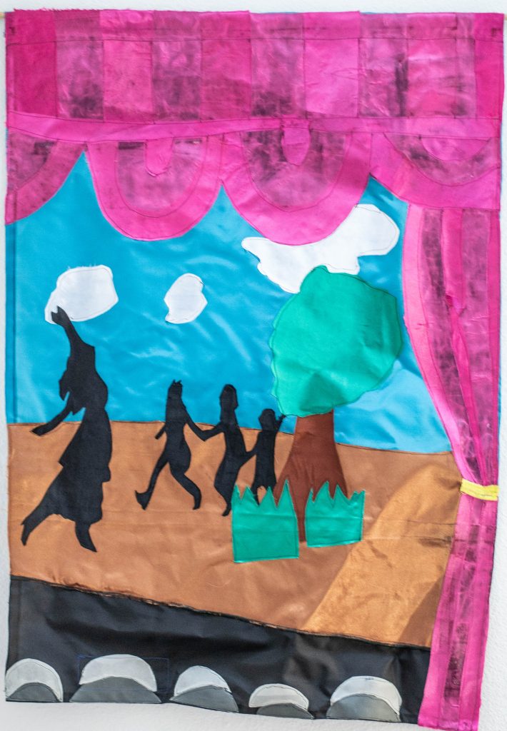
What Our Apprentice LaDe Richardson wrote about the flag design: “You have a lot of great things that you have done. So, with guidance from my team, I pinpointed your key details; community support of the arts and for kids, balancing work and your true love – the performing arts. You have been active in the community theatre scene in Cincinnati for 20 years and do everything from direct, produce, choreograph, including running the drama club at your school, Mann Elementary. With this I knew had to do something with the theatre, arts, and kids. So, I designed a flag that would capture these three things. I knew I wanted you to be in it too, so I thought of a school play with you helping your kids learn the parts as you direct the play. I decided to use the red curtains to enclose everything like seen on kid TV shows. I wanted it to be a fun scene. I added three kids and a woman playing, singing, and dancing on their walk somewhere. I use the color black to make those as a silhouette. Then I thought about plays and how the kids make the props and backdrops and decided to make trees and grass props and made the background a sky with clouds. I chose a bluish green color for the skies with white clouds. So now we have the red curtains, the stage with the trees and grass props and the bluish green color for the skies with white clouds for the background color. What’s missing?….the crowd of people. So, I added that to the bottom part of the design. I used the gray to create a contrast. The design is finished, but let’s make sure I captured everything; I want to show Amanda’s love and support in what she does. She is a great person who cares a lot for the arts and kids. She has the skills and talent to lead and direct a Theater play or show. But when I think of what’s most important, I think about the kids she works with, helping them create their plays and shows. The impact on those kids. I can see the big smiles on their faces and her ability to share this with the world and community. Check, I believe I have done that, captured the wonderful things she does.”
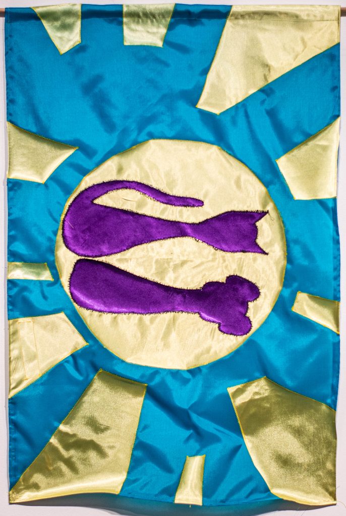
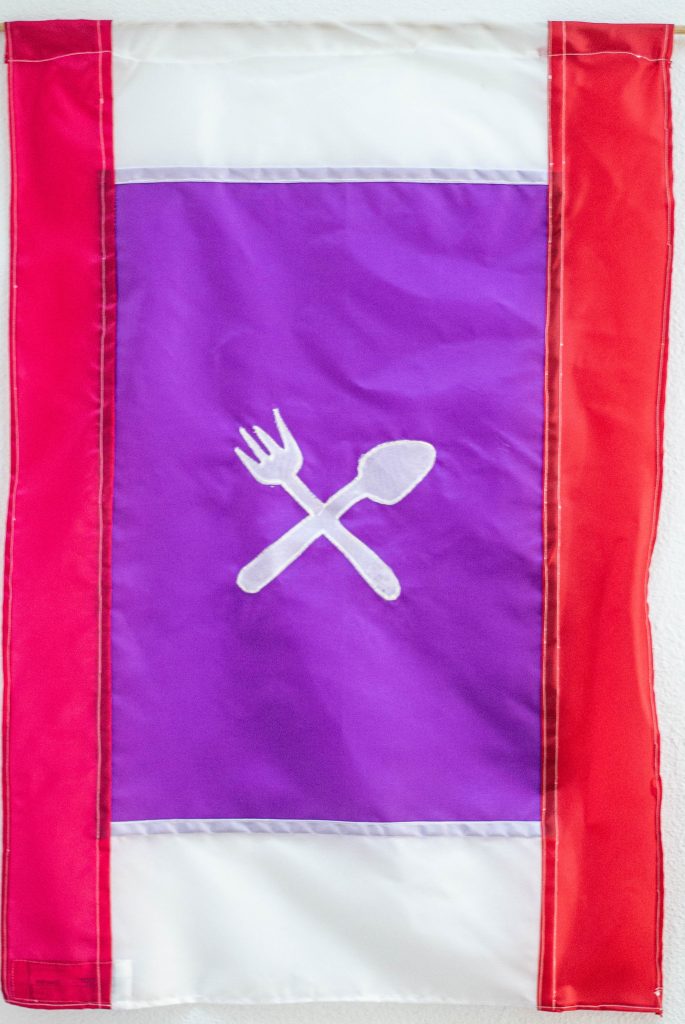
Mary Erpenbeck

What our nominator wrote: “Mary Erpenbeck has worked at Kroger for 25 years. She has been an essential worker throughout the COVID pandemic. Kroger stopped their ‘hero pay’ for essential workers as soon as other businesses started opening, despite their employees being at a high risk of exposure to COVID. On top of that, she is her husband’s full-time caretaker. She is currently working full time, care-taking for him full time, and facilitating construction on their home to make it accessible for his disabilities. She is truly selfless. In this season of her life, she has almost no time to herself. She has continued working and thus enabling people to get groceries during quarantine, despite the risk of bringing COVID home. Because of her, he is still getting better every day, even over a year after his brain injury. The past year of our experiences would have broken most people, but she continues to persevere because she is a true hero.
What Our Apprentice Regina Cooper wrote about the flag design: “I used blue, pink, and green to represent your stability, affection, compassion, and harmony. The infinity heart represents your endless love and caring for others, especially your daughter and husband. The fork and knife cross represents the food services that you have provided in this time of need. The caduceus represents the healing assistance for your husband. The background of the flag represents your strength and love.”
Jeanne Feldkamp
![]()
What our nominator said:
This flag was made by artist Lindsey Whittle.
Jennifer Foster

What our nominator wrote: “Our Hero is Jennifer Foster. Jennifer is a long time Avondale resident who works tirelessly every day to improve the lives of others in Avondale. Jennifer once had a career as a women’s professional football player, however that career was cut short when she became the victim of a drive by shooting, suffering a career ending injury to her leg. Rather than become bitter or retaliate, Jennifer chose to dedicate her life to fighting against gun violence and addressing the underlying issues that contribute to violence and disparity in our neighborhood. Jennifer is a Health Champion, a member of Reading Bears and Parents on Point, sits on Community Council, is the co- chair for the Avondale Safety Team, was instrumental in bringing the Louise Shropshire Mural to Avondale, and is even a member of the Avondale Running Club. Jennifer is also a single mother who successfully raised 4 kids and is a loving and devoted grandmother. Jennifer dedicates her spare time engaging residents, in positive activities in the neighborhood and mentoring single mothers. She is a role model and bright light in Avondale.”
What Our Apprentice Reagan Holtzman wrote about the flag design: “The color yellow was chosen for the base of the flag because it is often associated with light, happiness and triumph. The flower is a symbol of hope and perseverance. The design of the logo is meant to show the regrowth and the nurturing of Avondale that Mrs. Foster inspires.”
Don Freed
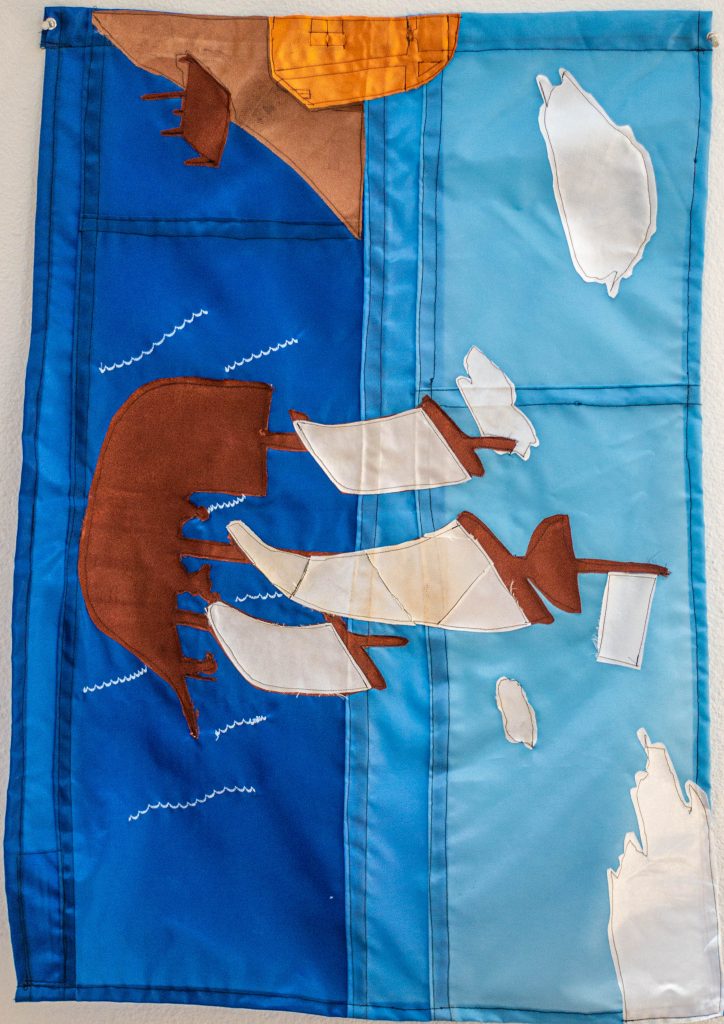
What our nominator wrote: “A true Cincinnati hero, Don Freed makes us laugh, he makes us smile, he’s always ready to listen, he’s a leader, he a mentor, a friend, whatever he’s doing he does it with a smile, he’s been a shining light that has help us grow. His warm greetings comfort families in need, making a difference for 25 years and giving over 26,000 hours. He has raised $135,000 for Ronald McDonald House Charities of Greater Cincinnati through his volunteer campaign fund.”
What Our Apprentice LaDe Richardson wrote about the flag design: “From the Information provided by the nominator, I have pinpointed that Don Freed is passionate about helping others whenever and however he can, bringing comfort and happiness to families in need. He is a leader who helps his team and others grow, creates a place where you can have fun and grow. He lights the path for others. So, with this in mind I thought of Don as being a leader of something that shows him helping others and having fun along the way. The first thing that popped in my head was Jake and the Neverland Pirates, a kids’ TV show. Jake and his friends go on lots of adventures having fun and helping along the way. So that is how the start of my design began. Basically, I wanted to create a scene with Don and his crew setting sail on a new adventure with his crew of little helpers from the Ronald McDonald House Charities’ HQ. A place where they find families in need and set out to help them while having fun along the way, recruiting kids from the HQ. In this design I chose a dark blue sea with waves of light blue highlights featuring Don setting sail with his crew. I wanted the sky to be a light blue too but that has a mood of the rising morning(that gradient effect). I added a dock on the shore and made the HQ house bright orange and yellow to touch on the happy and fun part of the design. Finally, topping off the design with some white clouds in the sky. I want to see what Don and his Crew does next.”
Sherri Friedman
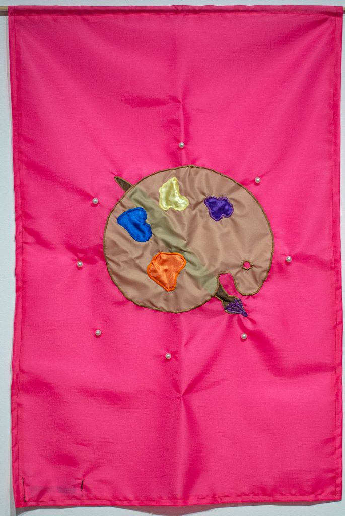
What our nominators wrote:
“Sherri J. Friedman is the Co-Founder and Chief Executive Officer of Most Valuable Kids of Greater Cincinnati. She has been the CEO of MVK since its inception in October 2005 and has been responsible for the growth of the organization, which has distributed over 141,000 tickets/experiences to deserving kids. Sherri currently serves on the board of the Holocaust & Humanity Center and formerly served on the Jewish Film Festival Committee, the executive board of the Mayerson Jewish Community Center and The Cincinnati Children’s Theatre. She is co-inventor of an award-winning juvenile product, the Stoplight Clock, that can be found online and in retailers nationwide. Prior to founding Most Valuable Kids, Sherri worked in the public relations industry at Sive/Young & Rubicam and Edelman Chicago. Her current passion is the continued success of MVK Cincinnati, the growth of Girls with Pearls, and her family.”
“Sherri selflessly pours her energy, time, and treasure into making unique experiences a reality for greater Cincinnati residents. Experiences wide ranging and meaningful. Experiences range from sporting events to arts to coaching healthy behaviors and attitudes. Her empathy, optimism, and work ethic inspire everyone. Sherri makes Cincinnati a better place to live and will have a lasting and exponentially positive impact on our community. Sherri is always trying to help others and this nomination will be a well- deserved thank you for her commitment to our community.”
What our Apprentice Danny LaCharity wrote about the flag design: “For your logo, I chose a paint pallet surrounded by pearls, representative of the art education given at Most Valuable Kids, and your work with Girls With Pearls.”
April Gallelli
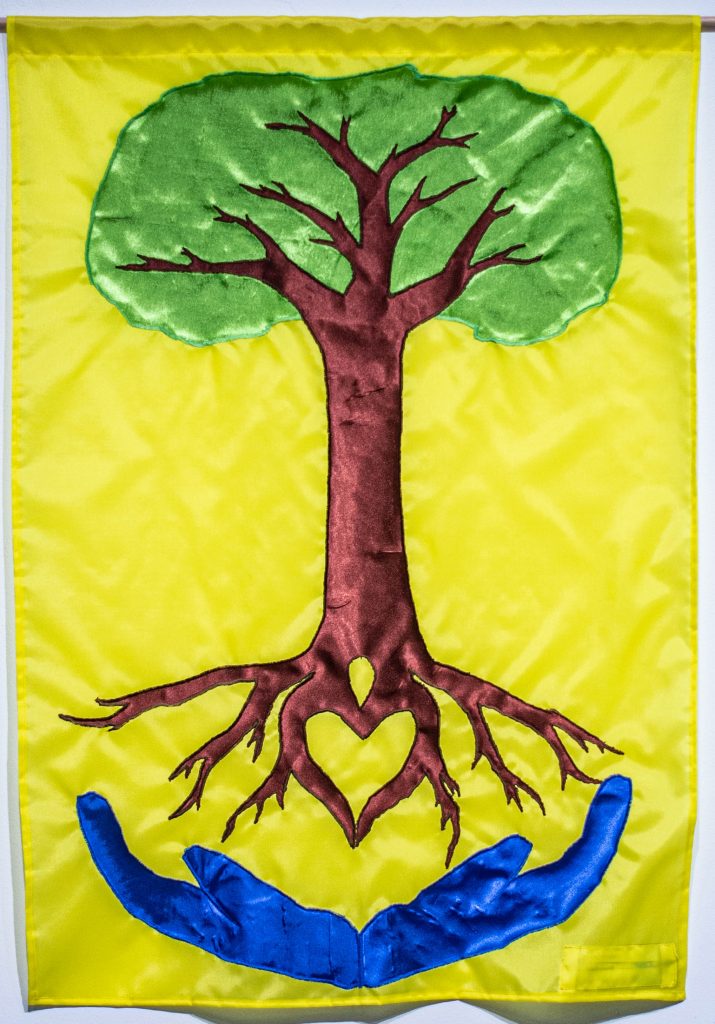
What our nominator wrote: “April Gallelli is a Project Manager for the Avondale Development Corporation. She works around the clock to support those in need living and working in Avondale. I don’t know how she does it all. From organizing and solidifying the Avondale Quality of Life plan last year to her ongoing efforts at dismantling drug activity and violent behaviors in the neighborhood, April is a true Cincinnati hero. She cares for all and embraces those around her like they are her family. I have worked with April on all of our public art initiatives in Avondale since 2016 and she has truly inspired me each with each and every project. You want April in your corner because she does not give up.”
What our Apprentice Simon Foster wrote about the flag design: “I chose to make the flag yellow because you bring joy to those in need and are optimistic about making the world a better place. The hands symbolize the support you provide for others, and I chose to make them blue to represent the healing that you have done for the community. The tree signifies how you embrace and love everyone like family.”
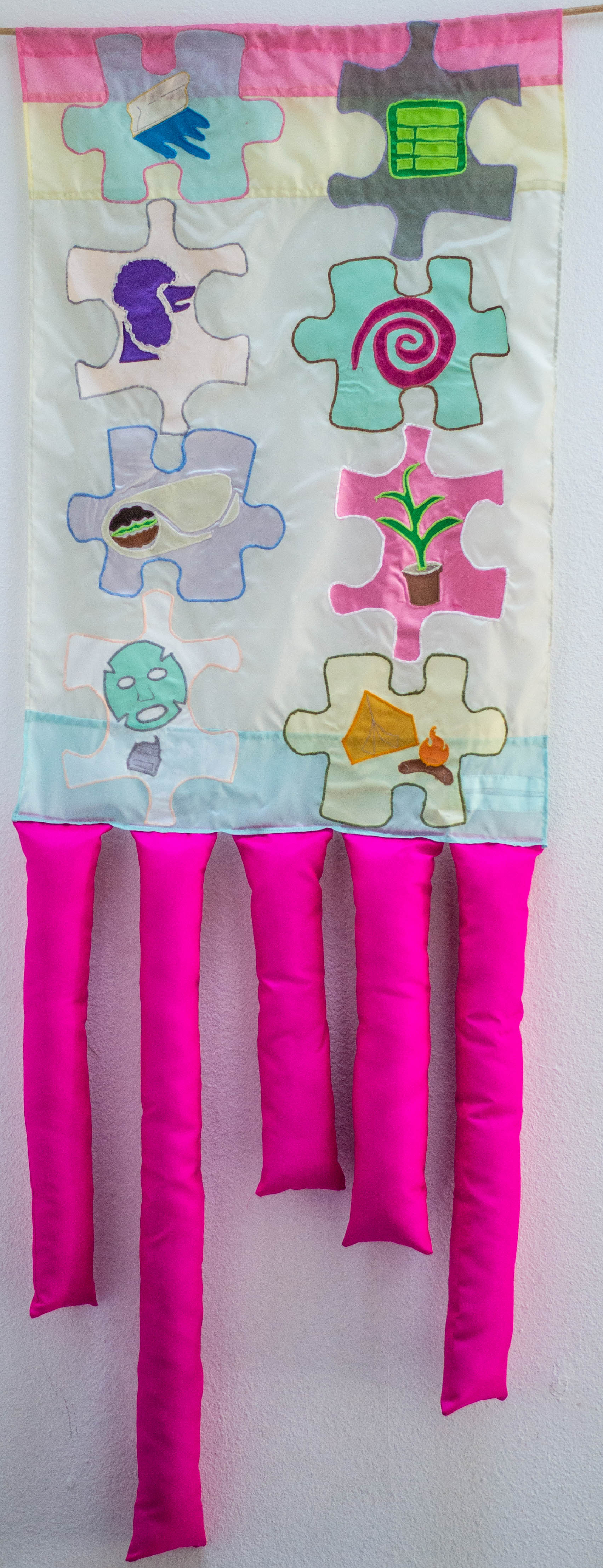
Kerissa Hicks
What our nominator wrote: “My community hero is Kerissa Hicks, a colleague and friend. She is the enrichment program manager at Roberts Academy, but does far more than just manage the enrichment for the students in the after-school program. Since COVID came to disrupt the daily routine of all of our daily lives, Kerissa, along with our entire team of our community learning center worked literally 12-hour days to pivot our work from in-person to a virtual platform. Kerissa has not only ventured into a new world of virtual enrichment, she has embraced it! She does a morning greeting each day, sometimes from her greenhouse in a banana suit, or showing how to build a giant tower with found objects in the house, or some fun, random place in her Captain Kerissa cape! She has texted, called, reminded hundreds of students and parents about the new Google platform and how to join. She has developed new connections and partnerships, asking and encouraging new ideas and innovating partners to invent fun and engaging ‘clubs’ to enrich the online learning experiences for ALL students. Kerissa is always willing to add to her plate by volunteering her thoughts and ideas by joining a committee or new coalition, adding her input to bolster the manner in which we collectively serve our students, parents and greater community. She can be found driving about town delivering baking kits, circus kits or helping to distribute Chromebooks to families who did not have a device at home. She is the epitome of a team player, a true community hero, ensuring the playing field is leveled so everyone is guaranteed the ability to thrive!”
Our Apprentice Essa Britt created this flag design.
Charlie Holmes
What our nominator wrote: “Charlie Holmes began Kairos Prison Ministry 23 years ago. He hosted his first prison retreat in 1997 with 5 inmates. Afterwards, he got their contact information and began sending them birthday cards every year. Today, he sends birthday cards to over 300 inmates in 20 different prisons. He pays for the postage with his own money. In addition to sending the birthday cards and hosting retreats, Charlie also does the Angel Tree program each Christmas. Because of the Angel Tree program incarcerated mothers and fathers are provided the opportunity to give their children Christmas gifts, through churches that participate in the Angel Tree program. Charlie personally takes on 50 kids each Christmas at his parish, Queen of Peace Church, in Hamilton, Ohio. Parishioners purchase the items that their parents request, and Charlie delivers them to the kids with a plate of homemade cookies made by volunteers at the church. The Kairos Prison Ministry has been quite an asset to those inmates that are willing to let Jesus into their lives. Most parishioners at Queen of Peace don’t even know what Charlie does. He is a silent angel of sorts, a quite hero, with a heart of gold!”
Our Apprentice Essa Britt created this flag design.
Rhonda Holyfield-Mangieri
What our nominator wrote: “Rhonda Holyfield-Mangieri is an amazing community volunteer! After a very successful career in HR, Rhonda devotes her time now to many nonprofits and causes. She mentors a Cincinnati Public School principal in the Leader-to-Leader program. For AARP, she is a volunteer seminar leader, teaching seniors around the country the dangers of cyber scams. She is very active in her church and helps organize her family reunion every year. Before her retirement, she was the Senior HR Director. She is a such a wonderful and incredibility intelligent leader in our community.”
What our Apprentice Gwyn Barnholtz wrote for the flag design: “The hands in the background represent several aspects of your community service. The hands represent your service as a community volunteer, helping your community as part of a group. In the use of different colors, the hands represent your fight for diversity, equity, and inclusion for all people. The middle icon of a person lifting another up represents your mentorship and leadership through multiple programs. This includes your work for the AARP teaching seniors about cyber scams, and also leading Mentor to Mentor programs for a Cincinnati Public School Principal. You continuously lift others up through guidance and teaching others how to better themselves, and that dedication is acknowledged by your community. For the colors of the flag, I chose green to represent growth, hope and generosity of your service to your community. I chose blue to represent the leadership and intelligence that help guide others to better themselves. I chose yellow to represent positivity and activity, showing your activism in your community and drive to make Cincinnati a better place.”
Marquicia Jones-Woods
What our nominator wrote: “Marquicia Jones-Woods is a hero in the West End. She’s a third-generation West Ender. Its where she raised her twins and adopted daughter, but truthfully, she’s helped raise many children. She has been running the Q-Kidz dance team for 30 years. The all-girl, multi-aged dance team has been performing and competing since the beginning. Marquicia provides a safe place for them to socialize and work together towards a common goal. The virus lockdown has made things very difficult for her and the organization, but she has never given up on the girls. She has worked very hard to teach them about wearing masks and getting them set up to be able to safely start practicing together again. She has also worked for C.M.H.A. (Cincinnati Metropolitan Housing Authority), where she served as Lincoln Court Resident Council President, a resident advisor for Hope VI, and Vice President of the C.M.H.A. Advisory Board.”
What Our Apprentice LaDe Richardson wrote about the flag design: “After hearing and learning about you, I knew I wanted to capture the motherhood, love and passion you have for these kids. Hearing these stories is just heart-moving. So, I wanted to show the passion, love, and pride in my design that you show these young women. I wanted to use her girls in the design because each girl has their own story. I chose the colors purple, green, yellow, brown, black, on a gray background. Purple for passion, yellow for freshness, happiness, positivity, and clarity, green for growth, harmony, lastly black and brown to symbolize power, strength, authority, elegance, seriousness, wholesomeness, reliability, home, grounding, foundations, stability, and warmth. These are the traits I see and have heard that you have and represent you.”
Radha Lakshmi
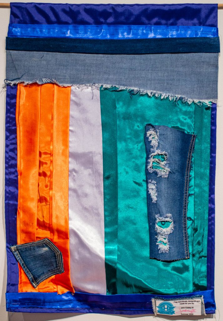
What our nominator wrote: “Radha Lakshmi is one of my communities’ heroes. Radha is a gifted artist originally from Chennai, India who brightens up Cincinnati with her many talents. I have been part of her projects at the Contemporary Art Center, Kennedy Heights Art Center, the SOS Art exhibit at the Art Academy, and Music Hall. Her healing mandalas and prayer flags have been part of many community events. She is also an amazing cook and grandmother, but her art and soul just really light up Cincinnati. She has a way of making each person she meets feel special. During COVID, she printed hundreds of mandalas and sent them to people for unity during this tough time. She had kids through Westwood Town Hall, Kennedy Heights Art Center and Wave Pool color her art, as well as adults from all over. Radha is one of my superheroes. I hope that we can all grow in love and acceptance of others like Radha does. In addition, Radha is fighting cancer but does not let that stop her from showing love and creating peace every day.”
What our Apprentice John (Trey) Easley wrote about the flag design: “Radha, your flag was the flag that I wanted to do the most. I wanted so badly to put the word RAD on it but this being my first time to sew I could not get it just right. I went to your website and I saw a lot of patterns that I personally loved and wanted to put on your flag. Since, I’m not that great on a sewing machine so I tried something different. I took some old denim and ironed it on for something that you wouldn’t see everywhere. I know that you were originally from Chennai, so for the background of the flag I included the Indian flag of orange, white, and green with a blue circle in the middle.“
Kick Lee
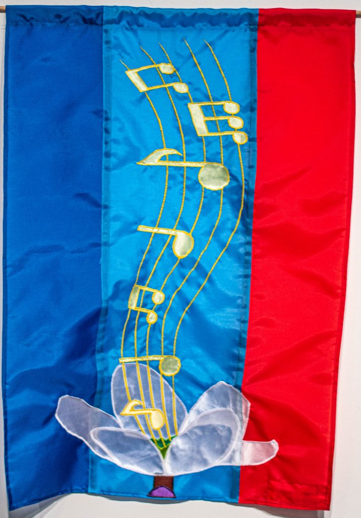
What our nominator wrote: “Kick Lee created a career and a lifestyle based around helping others achieve their dreams. As the founder of the Cincinnati Music Accelerator, he’s helping local musicians realize their worth as artists and discover how to take control of their own careers. Kick uses his energy to build up the community instead of creating competition between artists. Coming from humble beginnings in the foster system, he learned to overcome adversity and see the positive in the world. He’s building community and turning Cincinnati into a music city.”
What our Apprentice Simon Foster wrote about the flag design: “I wanted to capture your passion for music and for helping others. The flower is one from a blackthorn plant, or prunus spinosa, which represents overcoming obstacles and seeing hope for a better future. I observed that you grew to see positivity in the world and sought to help others through your passion for your music, which the yellow music notes rising from the flower, represent. The background colors represent the colors of your company through which you help others with their passion as well.”
Cindy Luckey
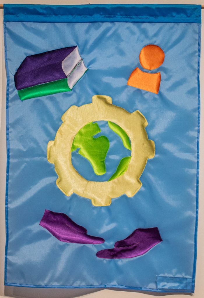
What our nominator wrote: “Cindy Luckey has been the School Librarian at the Academy of World Languages for 13 years. She is a constant support and cheerleader for our entire AWL community. Cindy has an incredible passion for her role as librarian. She works tirelessly to create programming that connects staff, students and families to the latest trends in the world of print media and technology. Cindy supports all school events and leads author visits, book fairs, pumpkin decorating contests, International Dot Day, book clubs and more. She volunteers with AWL’s Girls on the Run, helps plan the AWL International Festival, and does everything she can to share her AWL school spirit. Cindy’s commitment to our students is incredible. She invests her energy in getting to know each student on a personal level, not just academically. Students are always asked for feedback about books and other print materials that they’d like to have available. Cindy knows the importance of children seeing reflections of themselves in literature and she works hard to provide and promote that in our community. Through grant writing, book fairs, Go Fund Me and other campaigns, Cindy seeks to inspire the love of reading into all 585 students at AWL. This means finding books in student’s home languages (we have students from over 35 countries with about as many different languages), books that capture a range of experiences and characters, for example, children from diverse backgrounds in the U.S., children living in multi-generational homes, children in lower income households, children with immigrant parents, etc. Cindy also provides resources to our parent classes that allow them to stay in tune with their children and enhance their own learning. She makes herself readily available to our students, staff and families at all times. Most recently, Cindy has been a hero throughout our response to COVID-19. She was one of the first to volunteer to help us figure out how we can best connect and support our families who live in 32 different zip codes during this time. Cindy facilitated the delivery of over 130 donated (thanks to Community Learning Center Institute and Heartfelt Tidbits) Chromebooks to our students that did not have a device. Cindy worked with our volunteers (mostly other AWL teachers) to make arrangements for the device to be delivered safely to the student’s doorstep and helped troubleshoot any issues. Teachers were excited to see their students get online and students were eager to connect with their teachers and classmates. Cindy also led the creation of our AWL Summer Learning Plan, helping AWL staff create bitmojis to share in Google slides with links to videos and recommendations for summer learning. It’s such a creative way for students to learn more about our AWL staff and get recommendations for all the really cool learning opportunities available online this summer. Cindy is always there to support anything that benefits our AWL community and is a true hero.”
What Our Apprentice Lauren Fredickson wrote about the flag design: “The main focus of the flag is a gear with the world in the middle, this is representative of the integral role you play at the Academy of World Languages, and continuing to do it with joy, hence the yellow gear. The purple hands show the support you give to every student helping them get connected to everything they need to succeed during this difficult time.”
Nikki Marksberry
What our nominator wrote: “Nikki Marksberry is employed by Sands Montessori to help connect families within the school to local resources, but she regularly goes well above and beyond the responsibilities of her job. As a parent at the school, I regularly see Nikki around the community, working after hours at the school, and most recently, stepping up during the pandemic to help families who have been impacted by COVID. She’s helped organize drives for food and school supplies, games and personal care items. It’s not uncommon to find her standing out in the rain, either collecting items or helping to hand them out to families in need. She does this all as a single mother. Her passion for helping others is contagious. She does it without complaint and has helped so many throughout the Mt. Washington Community. I know she’s involved in several other organizations and helps make sure the local Blessing Boxes stay full around our community, but she also connects people to jobs and career resources, helps families with support and so much more. She’s the definition of a community hero in my book.”
What our Apprentice Danny LaCharity wrote about the flag design: “I chose the hand symbol to draw reference from the Cincinnati Public School logo, the pencil for your work as a teacher, and the yarn and knitting needle for your interest in handwork and knitting.”
Lydia Morgan

What our nominator wrote: “Lydia is an amazing ‘connector’, always putting the pieces and people together to get things done. She encourages new residents to find out what is going on in the community and become an active participant. Among her passions is that people don’t forget the history of Kennedy Heights, an intentionally racially integrated neighborhood. Whether at church, the Arts Center, Kennedy Heights’ annual Sap Run breakfast, or her famous backyard barbeques, Lydia extends a gracious welcome to all. Her spirit of inclusiveness has made a substantial imprint on the Kennedy Heights and our city as a whole. Lydia Morgan has been called an unofficial diversity ambassador in Cincinnati for 24 years. Her service and support in her neighborhood of Kennedy Heights is extensive. She founded the local Juneteenth Festival and is a long-time community leader and volunteer. She soon decided Cincinnati should have this event, too. Initially, the event was a neighborhood festival sponsored by Kennedy Heights Community Council. Over the years, Lydia and her team of dedicated volunteers learned about getting permits, writing grants, finding artists, food vendors and many other concerns. For eight years, it was held in Drake Park, then moved to Eden Park. Now Juneteenth is an annual festival attracting thousands throughout the Greater Cincinnati region. It features diverse, free, family-centered activities such as traditional storytelling, art and folk crafts, historical displays, children’s activities, sweet potato pie bake-off, music (blues, African drumming and dancing, gospel, jazz, reggae, salsa) and more. Serving food is a mission for Lydia. You will often find her in the kitchen at Kennedy Heights Presbyterian Church preparing meals for church and community events. Since 2014, the Community Council has been serving a free community meal to residents before the KHCC monthly meeting. Who do you suppose is in charge?”
What Our Apprentice LaDe Richardson wrote about the flag design: “Reading about your many accomplishments, your iconic and legendary status, I wanted your flag to represent and capture your many gifts in the flag design. I wanted it to be like something you would only find in a treasure room or in a royal palace. To do this I added a rusted shadowing over the shine or treasure to get the look I wanted. I fused the Kennedy Heights Flag and Juneteenth Flags or symbols. To represent the fact that you’re known for cooking and serving food at events you hold or are part of, I added a frying pan in the center to bring everything together. “
Susan Noonan
What our nominator said: “Susan began her journey of making a difference in our community after receiving her Master’s degree in Criminal Justice in 1988, when she was hired by the Community Human Relations Council as the first police-community relations staff member. Susan’s work was recognized by many and she is devoted of many organization including Woman’s City Club, Cincinnatus Association, FBI Citizens Academy and more. She volunteered with the National Head Injury Foundation, serving as local chapter president and as a member of the state board. Her most recent efforts include co-chairing the Mayor’s Gender Equality Task Force. She was selected for this role as result of co-chairing a 3-year process to pass CEDAW (Cities to Eliminate Discrimination Against Women and Girls). CEDAW grew out of the dedication of 12 organizations passing a resolution in 2015. City Council passed (9-0) the CEDAW Ordinance. Cincinnati is only the 7th ordinance passed in the US. This puts Cincinnati way ahead of most cities in supporting the elimination of discrimination against women and girls. Susan’s professional and volunteer life is complimented by her devotion to her family.”
What Artist Lindsey Whittle wrote about the flag design: “I made the base flag out of dark blues because that was the color used to represent criminal justice degrees. I picked the symbols of family, a fireplace, a dog and a cheery tree to be the center of the flag to represent how you dedicated your life to gender and racial equality and many other social justice issues.”
Toilynn O’Neal Turner
What our nominator wrote: “Toilynn is fully invested in the city of Cincinnati. She’s worked at St. Ursula Academy in Walnut Hills for the past 20 years and currently serves as their director of diversity. She works for the Cincinnati Visitors Bureau, helping to develop multicultural entertainment for Fountain Square in the summer. She was the interim executive director of the Queen City Foundation, an organization devoted to helping young people succeed in 2018. Toilynn herself benefited from QCF, and she says it’s one of the reasons she is who she is today, doing what she’s doing to elevate young women in Cincinnati and inspire them to become leaders and community change agents. She’s also an ArtWorks alum.”
What Our Apprentice Regina Cooper wrote about the flag design: “Since you support our community by raising up others and creating change in our community, the flag shows hands raising up a heart. By using red, pink, blue, and yellow, the flag represents your unity, friendship, love, and passion towards your community. The shapes in the base flag show the support and peace that you apply to the community. In all, this flag represents your devotion and kindness.”
Rosemary Oglesby
![]()
What our nominator wrote: “Rosemary Oglesby is the founder of Rosemary’s Babies. It’s a nonprofit organization that helps teen parents overcome adversity and provides support and education to encourage healthy relationships with young parents and their baby. I think Rosemary is a trailblazer having been a teen mother and starting this organization seeing there was a need for it in our community.”
What our Apprentice John (Trey) Easley wrote about the flag design: “With your flag, I knew right off the bat when I heard about your program, I wanted to do. I’m making a baby. So, I started to look up ideas and colors that represent motherhood and the colors I came upon were yellow and pink. I was going to put your logo on the flag but as a first-time sewer I needed something else. Since your logo had yellow in it, I knew I wanted to put yellow in mine as well. I was thinking, what are babies most known for? Off the top of my head I thought their fluffy cheeks. I immediately stuffed the baby’s face with stuffing. As this was the first time for me, I wondered how am I going to sew this up? I hand stitched it! I just want to say thank you for what you are doing. I feel that young moms also get pushed down and I think all they need is help and love. I feel you are making them feel loved. A sincere thanks from myself and everyone at ArtWorks for all that you do to serve our community.”
Aaron Parker
What our nominator wrote: “I would like to nominate Aaron Parker, a teacher I have gotten to know over the past 3 years. Mr. Parker works at Aiken High School as an ESL teacher. Many of Mr. Parker’s students are refuges for across the world and have only been in the United States for a short period of time. For many of them English is the 4th or 5th language. The first time I met Mr. Parker was during one of ArtWorks’ interview events. Mr. Parker had called ahead to ensure there was space for 10 more ESL students. When he arrived, he supported each applicant in filling out the application and made sure to give them pointers before the interview. This has continued for three years. Each year Mr. Parker works to share this opportunity with his students and brings them, after hours and on weekends, to our interview events. He has championed this opportunity for his students as a way for them to practice speaking English over the summer and to grow their network of friends and peers in a new city. Each year I have had the honor of getting to know several of the amazing young people he encouraged to interview. Mr. Parker’s support does not end at the interviews. Each year he has been crucial in helping these youth through the application process, completing new hire paperwork, and making sure they get to the job site on day one. Mr. Parker is always willing to go the extra mile to help these young people ensuring they are successful in their summer experience. Mr. Parker is a hero every day and deserving of all the recognition. I hope we are able to honor Mr. Parker with this token for his dedication to supporting young people become their best possible selves every day.”
What Our Apprentice Regina Cooper wrote about the flag design: “Because you are a true leader in our community, the dedication and influence you provide to your students are represented in this flag by using green, blue, and yellow to show your strength, stability, and generosity towards others. The circle of hands was implemented to display your dedication with generosity and unity. The base of the flag exhibits a symbol of leadership and collaboration which you show to each of your students. This flag shows the unity, stability, and kindness that you show every day.”
Alandes Powell
What our nominator wrote: “I met Alandes Powell this year as she led the vision and organizing of the Black Lives Matter mural in Cincinnati in front of City Hall. She is a strong and effective leader who mobilized resources and community action over the course of one week to meet an ambitious goal —to paint a mural by Juneteenth, an important date celebrating the emancipation of slavery in the United States. Alandes was bold and intentional, with her vision and her follow through, hiring a collective of local black artists to lead the project. She did a world-class job of fundraising, event organization, documentation and gave a platform to the artists to speak to the media and to government officials. The artists were photographed, interviewed and their profile has increased as a result of being part of this historic mural. The dedication event was powerful. Alandes led a powerful call and response ‘We Want what You Want.’ Truly Alandes is a courageous woman of action who made an important work of public art and possible – harnessing our communities potential to come together and create art that is a symbol of a movement for needed change. I truly believe that the Cincinnati Black Lives Matter is set apart from murals in other cities, because of the leadership and intention by who painted it and the speech it represents as well as the excellent artistic design and execution.”
What our Apprentice John (Trey) Easley wrote about the flag design: “You changed lives, saved lives, and overall spoke up for our community. So, with your flag, I tried to capture Black Lives and the work you do. I spent several weeks on the ideas of this flag. I spoke to family and friends asking them how can someone truly capture Black Lives Matter? The answer everyone came up with is it’s not possible to put everything black people or colored people went through in one thing. So, I made the African American Flag with the colors red, black, and green. I also added in several different tones of black people. At the end of the day, I wish I could add more things on the flag, but this is a serious topic that is benignly covered so I felt like the flag should be serious as well. I want you to know that making this flag for you was one of the best things that I think I have ever done. BLM is a topic that is so close to my heart.”
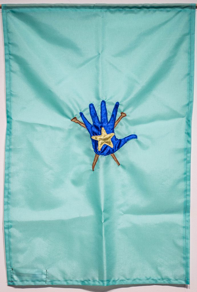
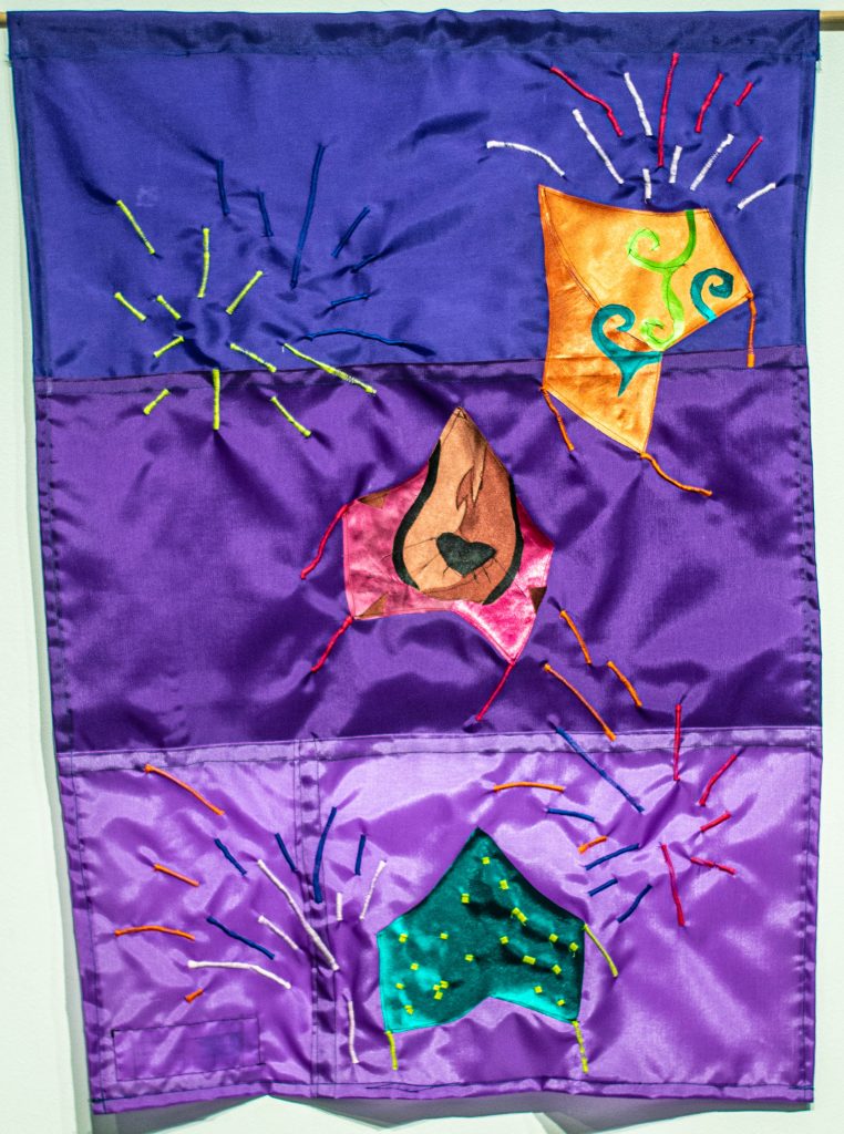
Tommy Rueff
![]()
What our nominator said:
What our Apprentice Gwyn Barnholtz wrote for the flag design: “From your Nonprofit, Happen Inc., I wanted to incorporate some of the programs offered. One of those programs is the Toy Lab. The silhouette of the Toy Lab logo is in the left corner, along with a lightbulb representing the ideas and creativity of the kids and families who use these programs. Another program that is represented is the KMNH Team, through a clapperboard. The hands forming a heart near the bottom of the flag represent the message and mission of Happen Inc.- to bring families together through love and creativity. Inside of the hands is an apple, which represents the Happen Inc.’s Community Gardens service. Separately, the yellow is used to represent the inspiration, happiness, growth, and optimism of the youth and families that use the Happen Inc. Program. The message of Happen Inc. touched me while making this flag, and it was inspiring to hear how the nonprofit has impacted families in Cincinnati.”
Daniel Souder
What our nominator wrote: “Daniel Souder, the owner and manager at Pleasantry Restaurant, is the very definition of a community hero. During a crisis and with restaurants struggling the most, he placed his efforts in organizing and carrying out donations to front-line workers at Christ Hospital and more. He took donations, worked overtime, and carried out a true community-based act rooted in selflessness. You can catch him smiling and always willing to accept anyone walking through the doors of his restaurant down the way.”
Our Apprentice Essa Britt created this flag design.
Joanie W.
What our nominator wrote: “Joanie W. has sewed countless masks for specific people and general distribution. Those for specific people are tailored to their personality, hobbies etc.- personalized. They are well made and beautiful. For example, she had multiple fireworks fabric for 4th of July.”
What Our Apprentice LaDe Richardson wrote about the flag design: “I connected with Joanie because I made masks in the summer with ArtWorks for people in the community. If I recall right, we made over 300 masks that summer. I wanted to help out and give back to those who are working during these challenging times. It was a way I could help out and to say thank you. In creating your design, I wanted to touch on the well-made and beautiful fireworks theme found in multiple masks you made. So, I made masks that in my eyes were beautiful and well made. The top orange mask has these plant-like shapes on it, the middle pink mask is a cheetah design, and the last mask is a green mask with yellow shapes in it. They are the main fireworks you see with the other standard firework around them.”
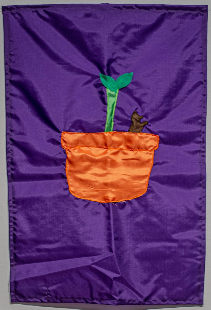
Chelsie Walter
What our nominator wrote: “Chelsie Walter is an incredible human advocating for people’s whose voices are too often ignored. She is the co-founder of Women of Cincy, a nonprofit media platform which highlights the stories of local changemakers and provides mentorship to college students. She works night and day with essentially no pay to keep this massive entity moving and growing.”
What our Apprentice Danny LaCharity wrote about the flag design: “I was inspired by your love of gardening and plants, hence the potted plant, the arrow and phrase in the Women of Cincy logo, and the mention of your love of sugar gliders.”
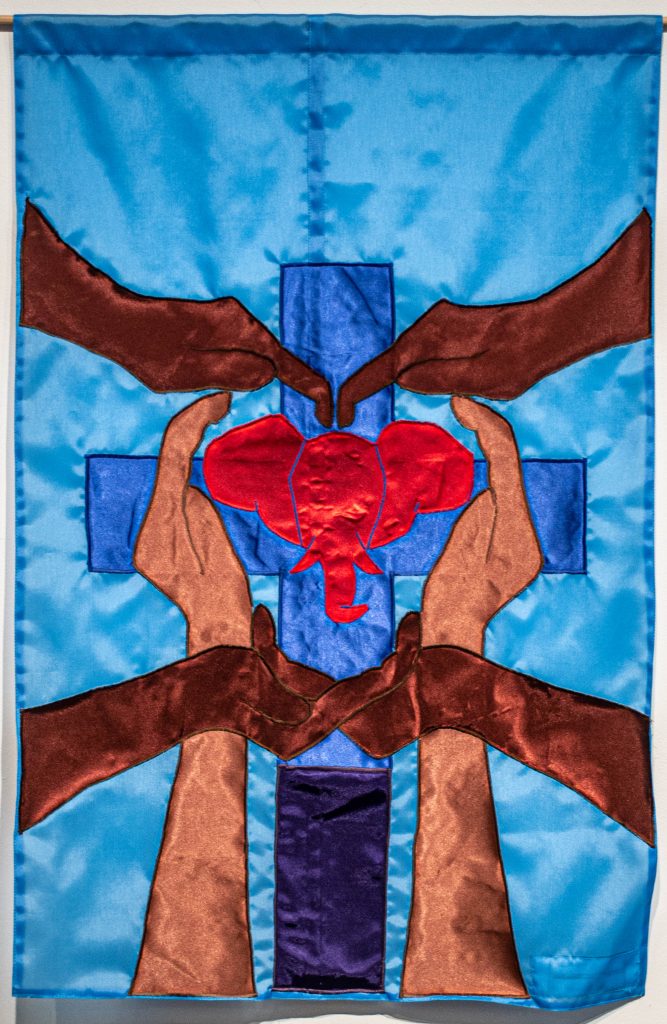
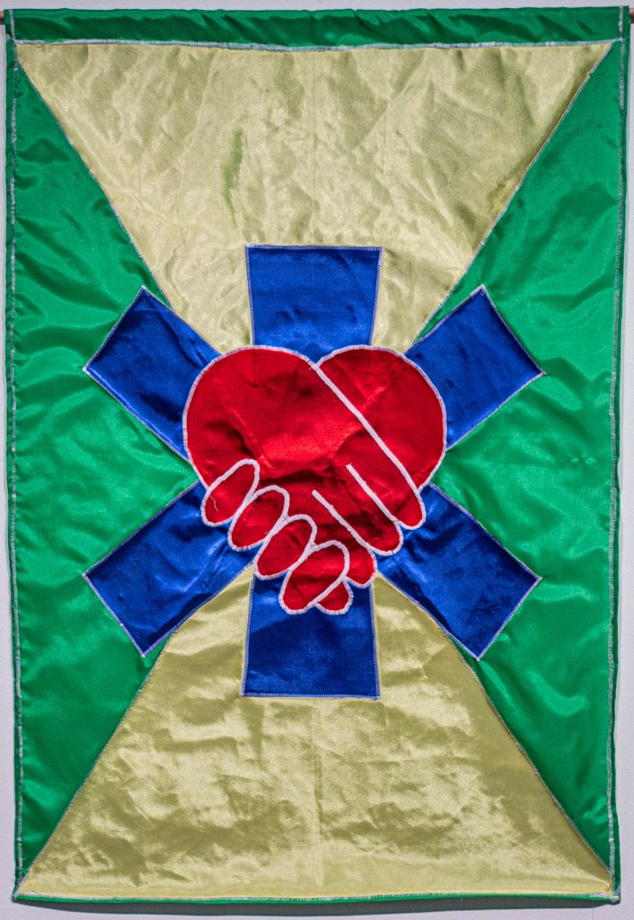
Judith Warren
What our nominator wrote: “Judith Warren is an incredible human whose defied odds and made waves in our community. She has led impactful organizations such as Health Care Access Now She’s a fierce leader and advocate for health, especially in marginalized communities and women of color.”
What our Apprentice Simon Foster wrote about the flag design: “I chose to make the base of the flag a light blue as a symbol of your healing and work in health. The cross in the middle is also a symbol of your work in health as well as your faith. I chose to have hands form a heart to represent your advocacy in health for the community, particularly women of color. Finally, the elephant in the middle is a symbol for your involvement in the Delta Sigma Theta Sorority.”
Lindsey Whittle
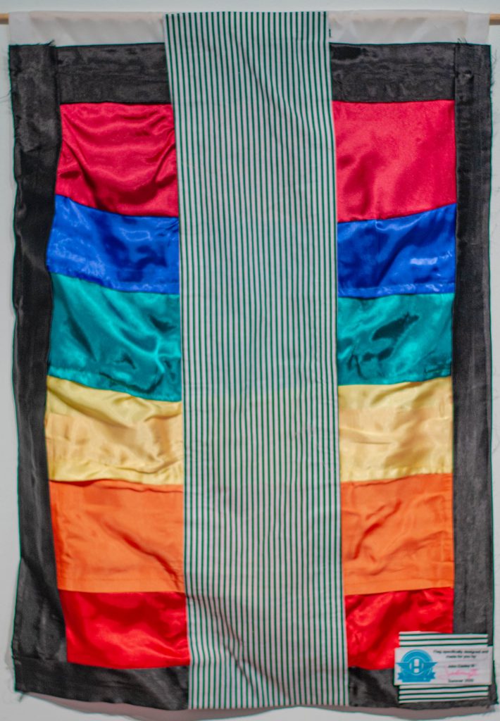
What our nominator wrote: “I nominate Lindsey Whittle as a community hero. One of her personal mottos is ‘Let your freak flag fly,’ so clearly, she just needs to have one. I have had the pleasure to be a student of a Lindsey’s twice. During our time together, she has proven to be immeasurably compassionate and patient. Her professionalism, energy, and work ethic is unrivaled. Whittle has encouraged me to do things that I never I never believed I could do. In fact, I don’t know if I could have done them without her encouragement because her belief in me gave me the strength to walk through the fear. Lindsey is immensely easy to talk to and is a wonderful source of information that she freely shares. Her most attractive quality is her ability to connect and create community through art making and that’s what really earns her this nomination. Even if I was the only recipient of her generosity, she’d still deserve a flag, but I’m not. She works tirelessly as a teacher and mentor to bring people together through art. Please celebrate this lovely lady with a big, beautiful, brightly colored flag because she deserves it! All hail, Sparklezilla!”
What our Apprentice John (Trey) Easley wrote about the flag design: “Your flag has all colors of the rainbow with a strip of stripes. To me the colors represent what people see on the outside and that is a colorful and bright personality. With the time I spent with you this summer and with what I have seen through your art there is not just color but also there is elegance and what’s more elegant in art than just plain black and white.”
Michael Zimmerman
What our nominator wrote: “Michael Zimmerman is a Cincinnati firefighter and is in the process of becoming a paramedic. He has been working, primarily in Price Hill, on the front lines of the COVID-19 crisis since the beginning. He has been putting his life on the line every day to help those in our community who are facing crises and emergencies. He is a devoted friend and husband, and a true community hero.”
What Our Apprentice Regina Cooper wrote about the flag design: “Because of your devotion and services to our community, I used green, yellow, and blue to represent your dedication and service in the face of danger. By using red, I represented the passion you hold for our safety. I used the star of life to represent the services you provide, and the heart hands to show not only your love for others but also your commitment to our community. All of these factors work together to create this flag of dedication, selflessness, kindness, and unity.“
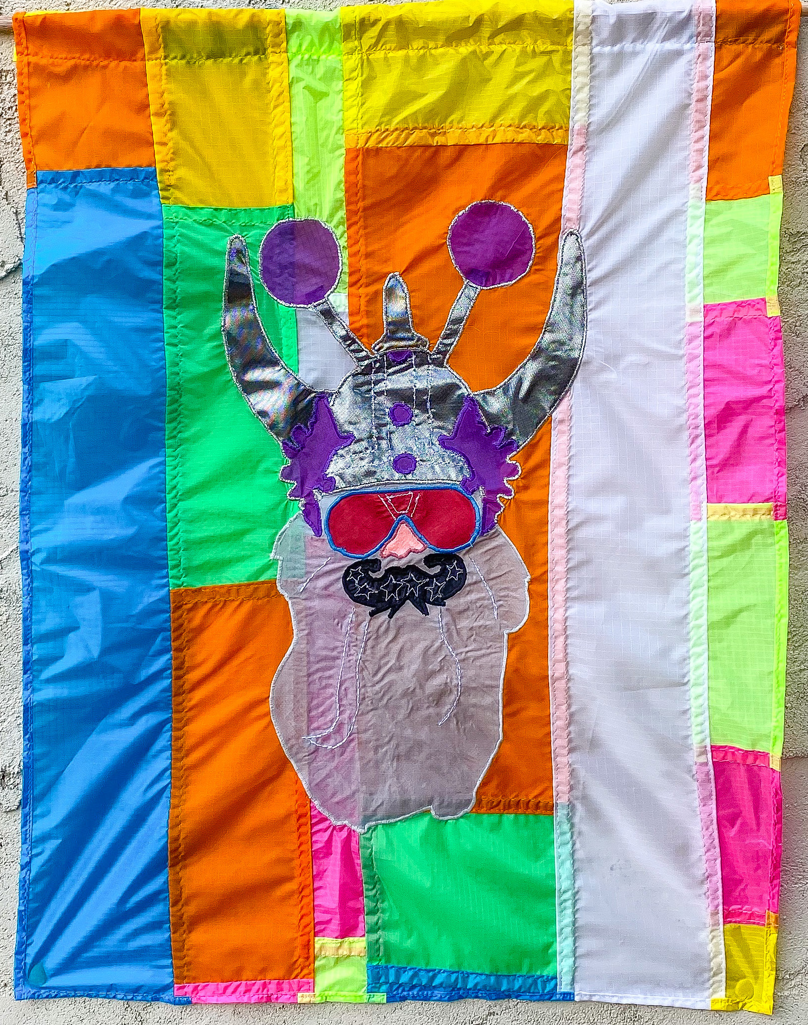
Additional Hero Flags Made During This Project


Thank You to Our Supporters
This program is generously supported by the City of Cincinnati’s Youth to Work, The H.B., E.W. and F.R. Luther Charitable Foundation, Greater Cincinnati Foundation, The National Flag Company and the William P. Anderson Foundation. ArtWorks thanks our ongoing funders ArtsWave, City of Cincinnati and the Ohio Arts Council.
Honor Your Hero
If you would like to make a gift in honor or in memory of your own hero, we invite you to support programs like these. Your generosity provides ArtWorks apprentices and professional artists the opportunity to make monumental works of art for our community.
About ArtWorks
ArtWorks is an award-winning Greater Cincinnati nonprofit that transforms people and places through investments in creativity. The organization provides youth, ages 14-21 with the majority from underserved households, with competitive 21st century career readiness skills through mentorship by professional artists. Since 1996, ArtWorks has employed more than 3,600 youth and 3,200 creative professionals, and the organization has completed more than 12,500 public and private art projects that includes 200 permanent outdoor murals, contributing to the region’s global reputation as an arts destination.